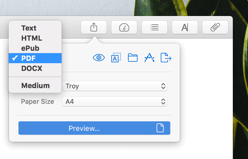
Ulysses lets you export your texts to beautiful PDF or DOCX documents, fully formatted. With different styles available, you can easily achieve a suitable layout for your writings. We know tastes differ and that various text types call for different formatting options. For Ulysses 2.5 we revised the built-in styles thoroughly and added a few new ones. Here’s a wrap-up.
Color Code
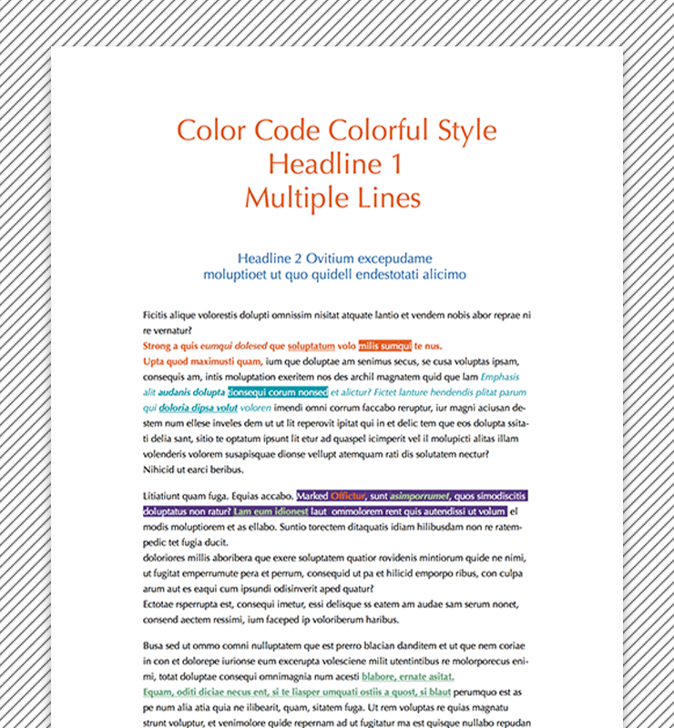
Color Code is an all-purpose style that plays with colorful highlighting. Orange, midnight blue, lilac and mint green in combination with black text generate an color-infused but still decent style with a professional look.
Tagged words and passages are marked in a prominent way, making important parts of your texts easier to recognize. The font family is Optima, an elegant sans-serif with delicate and tapering characters.
Novel Cochin
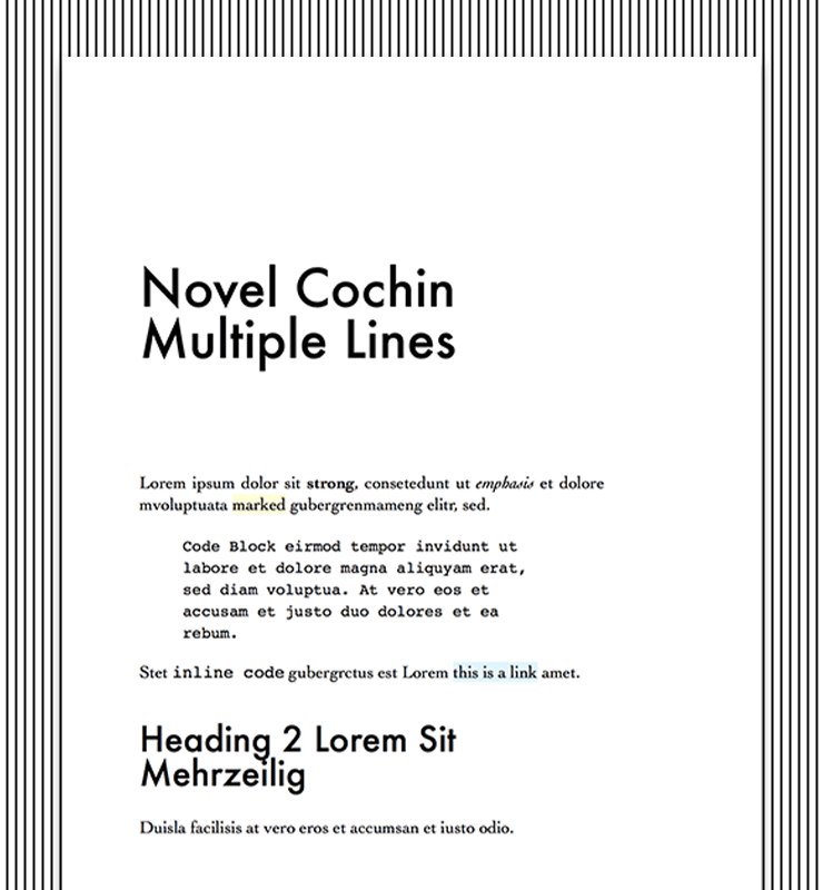
Novel Cochin is a style template for a two-sided, book-like layout, with the left and right pages having mirrored type areas. The style is unobtrusive and content-centered.
The text is written in Cochin, a serif typeface originating from old French copper engravings. Especially the ornamented italic cut is striking and very graceful. The headline-typeface is Futura which, with its geometric forms, gives a modern twist to the primarily traditional layout. A light yellow and a subtle blue show marked passages, annotations and links.
Tip: To view a two-sided layout within the Quick Export preview, right-click on one of the pages and select “Two Pages“.
Papers
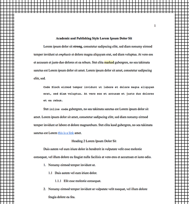
We have been asked frequently for an academic export style. There are a handful of academic publishing guidelines out there, the most established being APA, the Chicago Manual of Style and MLA. We combined their most important formal qualities with the opportunities Ulysses offers to create Papers.
Papers uses Times New Roman with 12-point font size, double line spacing and flush-left style. Uniform margins at the top, bottom, left, and right of every page are 1 inch. The first line of every paragraph is indented and page numbers sit in the top right corner of every page.
Tip: Like all Ulysses styles you can easily tweak Papers to meet your personal needs.
Rough Cut
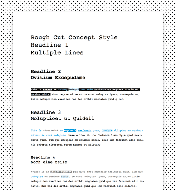
Rough Cut is an unpretentious style designed for text revision. It uses the monospaced typeface Courier exclusively. Monospaced means that every character of the font has the same width, just like when writing on a typewriter.
Distinctive layout elements like black or blue bars and bold labeling let Rough Cut appear modern and reduced, with a touch of coolness. To track the editing process, comments and deleted text passages are visible. Showing some of the markup tags underlines the unfinished state of the content, too.
Swiss Knife
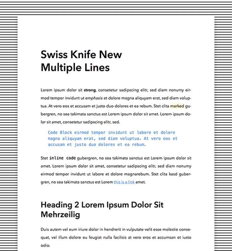
At first glance Swiss Knife could appear as unobtrusive. But sometimes you just want a solid export style without fuss and with proper typography. Swiss Knife combines these qualities.
The Swiss typeface Avenir Next provides good legibility and is the most prominent characteristic of the style. The only colors used in Swiss Knife are a cool blue for code and links and a faint yellow for marked text and annotations.
Troy
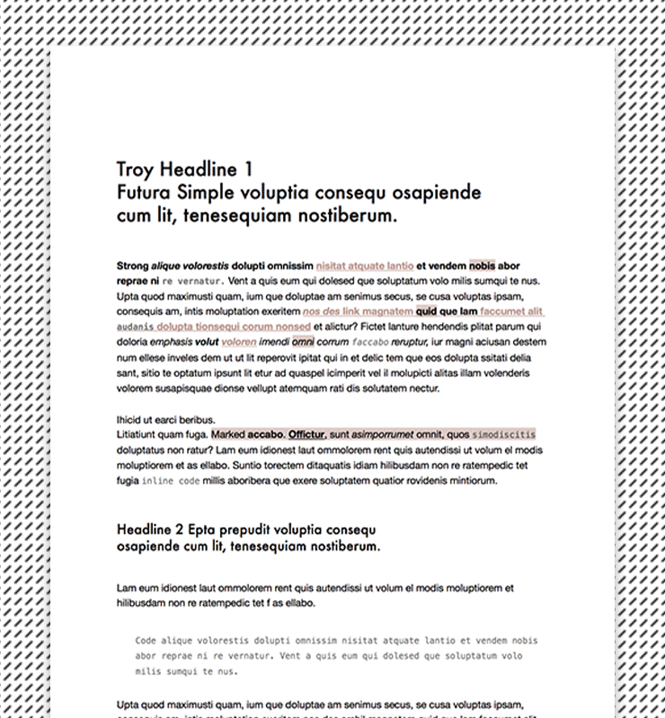
Troy can be described as modern and functional. Balanced proportions and two highly popular fonts (Futura and Helvetica Neue) let Troy become a sturdy option.
Both typefaces are typical Swiss sans-serif fonts from the 1950s—60s. The gentle nude color contrasts with bold black accents, giving the layout a classy quality.
We hope you like to use our built-in styles for your writings. Do you feel like exploring more styles? Then visit our Style Exchange for further inspiration. You can find a whole bunch of styles for PDF and DOCX to download there and – furthermore – for HTML or ePub export. All of them were created by Ulysses users. If you want to modify a style to your liking or get into making a new one on your own, the Style Reference provides you with all the information you need.
