Hey there, friends. Ulysses 2.8 is upon you, and I’d once again like to take this opportunity to shed some light on what’s new, and why we thought the changes and additions were great ideas.
Touch ID
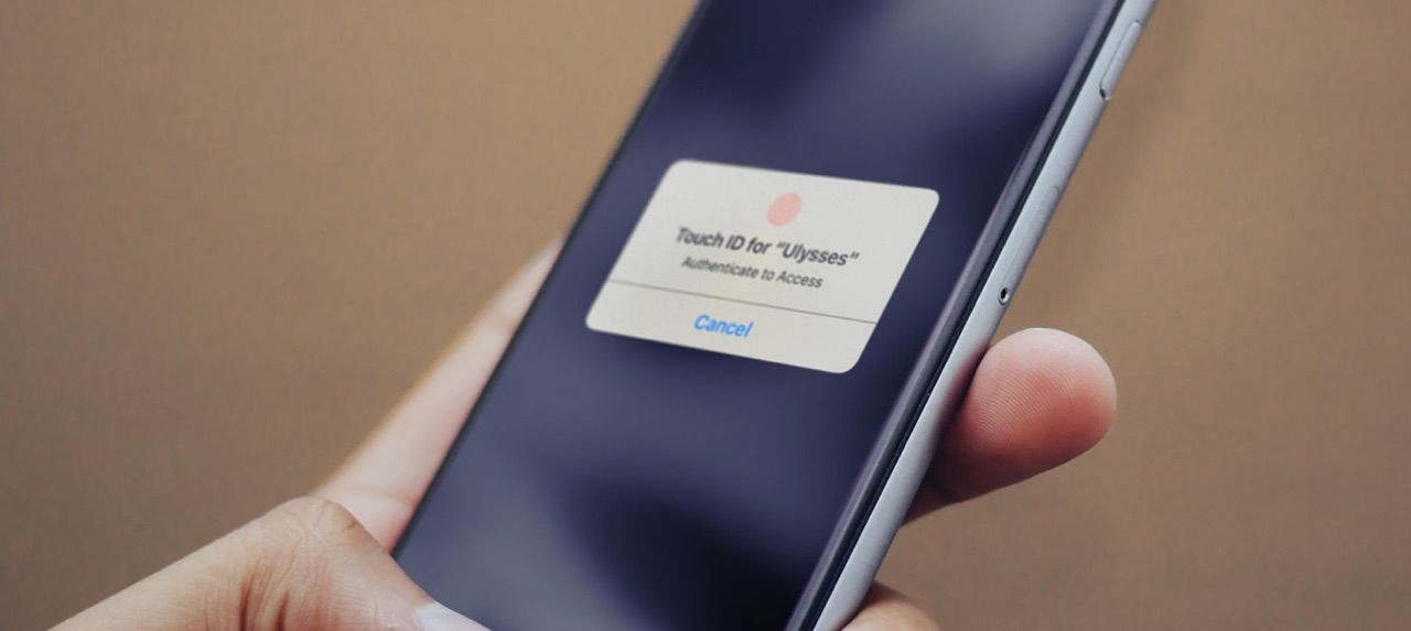
The most prominent new feature is Touch ID and Password Lock. It’s also the easiest to explain and rectify – locking was requested roughly a gazillion times, and seeing how Ulysses has moved to mobile devices, and how these device are oftentimes shared among family and friends, privacy is a major concern, and little if anything is more private than your writing (check your photos, though).
With locking we went for the “whole app” route, instead of “single sheets or groups”, because it’s simple, straightforward and quick. Turn it on, set a password, set an auto-lock duration, and you’re done. Touch ID is turned on by default on devices which support it, but you can of course turn it off, if you’d rather type than touch. And that’s about it. We hope you like it.
Group Statistics
Next up is group statistics on iOS. Also much requested, since it was available on Mac from day one. You can now swipe any group/filter to the left, select “Detail”, and then instantly see the amount of words, pages or such, calculated from all included sheets.
We put a single stat into Detail view (you can change which one), and all other stats into a drill-down view. We also made creating group goals dependent on the visible stat in Detail, since we figured that particular stat is what you want to set a goal for anyway.
The selected statistic is now also displayed in the “Select” view (within the sheet table). Again, we hope you like this – please let us know how if you do or don’t.
Clarus the Dogcow
The last thing I want to touch on are the new group icons. There was an overwhelming response to our call to icons, and while a lot of requests were awesome ideas, we figured we’d need to redo the selection process before incorporating the 100 or so additional icons we found interesting. So for this release, we focused on the most requested and “most fitting into the current selection and sorting”, and we will now start looking for ways to improve the icon selection view in a future release.
So, which icons made the cut?
![]()
Speaking of cuts: We decided to remove a couple of redundant icons, e.g. some lists, arrows and document-ish whatevers. These are now mapped to similar icons, so there shouldn’t be any “missing” icon in your library, just a slightly differing design. Feel free to complain, though, as this move sparked heated debates in our office, and we have a bet going on how this will be received, and I want to win. ;)
Anyways, that’s it for 2.8 from me. There are many more changes and additions (new x-callback stuff, for example), which are covered in the release notes and on our brand-new “What’s New” page. So make sure to check out all the good stuff and then get back to work.
Now have fun, and don’t forget to set a password for Ulysses. Because, “yes, we’re paranoid – but are we paranoid enough?”
