An outlook on Ulysses for iPhone and iPad and what you can do with it, part 6
To all you iPad Pro using writers out there: Please forgive the cheesy pun, and instead look forward to the release of Ulysses 2.5! You had to wait for this for quite some time1, but everything is going to be alright in the not too distant future.
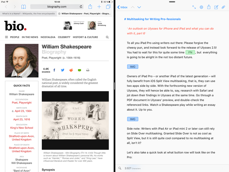
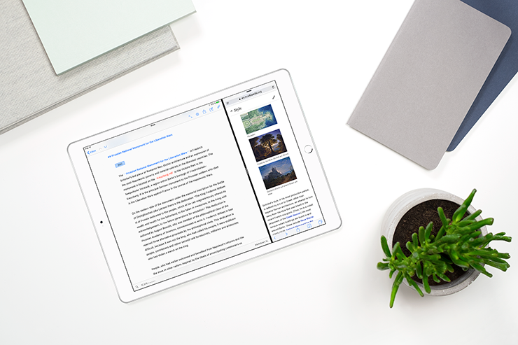
Owners of iPad Pro – or another iPad of the latest generation – will fully benefit from iOS Split View multitasking, that is, they can use two apps side by side. With the forthcoming new version of Ulysses, they will hence be able to, say, research with Safari and jot down their findings in Ulysses at the same time. Go through a PDF document in Ulysses’ preview, and double-check the referenced links. Watch a Shakespeare play while writing an essay about it. Up to you.

Side note: Writers with iPad Air or iPad mini 2 or later can still rely on Slide Over multitasking. Granted Slide Over is not as cool as Split View, but it is still quite cool compared to no multitasking at all, isn’t it?
Let’s also take a quick look at what button row will look like on the Pro:

Actually, we shouldn’t call it button row on iPad any more. This term referred to the customized Ulysses button row we invented when Ulysses for iPad was first released. Now there are customized Ulysses shortcut buttons that align right and left of the system’s text predictions (given you have them enabled). But hey, what’s in a name? The matter was, and still is, to improve the long form writing experience on mobile devices. Search, statistics, undo, redo, copy/paste reside on the left hand side, while quick access to markup tags, text actions and special character reside on the right hand side – it’s all there.
We’re so looking forward to Ulysses 2.5, and we believe that you, professional or hobbyist, have good reason to do the same.
- Yes, it took us longer than expected. But I can testify that I have never ever caught anyone playing Counter-Strike around here. ↩︎
