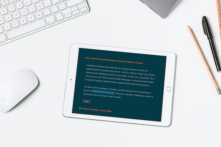
A pleasant workplace (and what else is a writing software for a writer?) is indispensable for enjoying what you do. And it's a matter of taste, too. Ulysses’ themes are for defining the colors of your editor so that you like it best. So, if you're up to a new look for your favorite writing app: I've browsed and curated a couple of themes created by other Ulysses writers well worth looking at.
A Sense of Spring – Green-Note
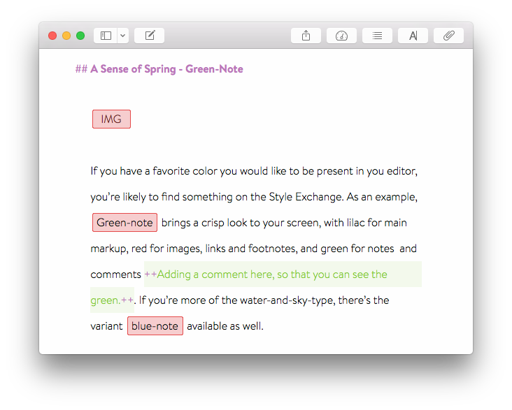
If you have a favorite color you would like to “see” in your editor, you’re likely to find something on the Style Exchange. As an example, green-note brings a crisp look to your screen, with lilac for main markup, red for images, links and footnotes, and green for notes and comments . If you’re more of the water-and-sky-type, there’s the variant blue-note available as well.
Keeping It Simple – Readability
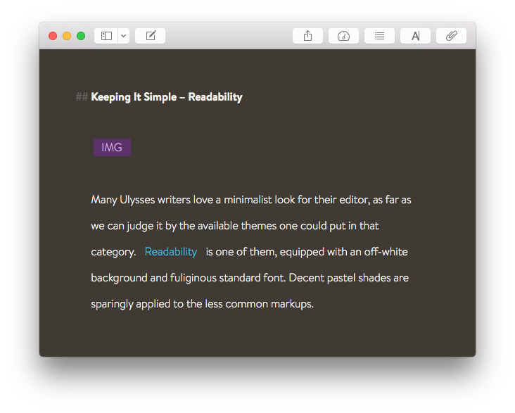
For the many Ulysses writers who like the minimalist look, there are a lot of themes to choose from. Readability is one of them, equipped with an off-white background and fuliginous standard font. In addition pastel shades are sparingly applied to the less common markups.
Keeping It Even Simpler – Writer
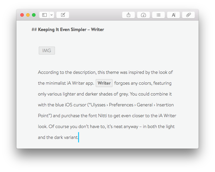
According to the description, this theme was inspired by the look of the minimalist iA Writer app. Writer forgoes any colors, featuring only various lighter and darker shades of grey. You could even combine it with the blue iOS cursor (“Ulysses › Preferences › General › Insertion Point”) and purchase the font Nitti to get even closer to the iA Writer look. It’s neat in both its light and dark variant.
Harmonious Color Palette – Solarized XL
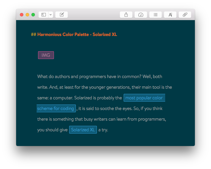
What do authors and programmers have in common? Well, both write. And, at least for the younger generation, their main tool is the same: a computer. Solarized is probably the most popular color scheme for coding, it is said to soothe the eyes. So, if you think there is something that busy writers can learn from programmers, you should give Solarized XL a try.
Update: After publishing this blogpost, Solarized XL creator Eric Carlson wrote me a few sentences about how it was made:
“For what it’s worth, I first stumbled upon Ethan Schoonover’s Solarized work while researching the colour scheme for my iPad app Voxen, a voice synthesiser for musicians. As musicians love to work in both the light and the dark, providing a switchable and well thought out scheme seemed perfect. When I began using with Ulysses, I found the built-in Solarized theme didn’t feel right because the colours, although similar, were not the same as those I had become accustomed to. One winter day I decided to do something about it, and a few hours later I found myself submitting the theme to the Ulysses website. It has continued to serve me well since its creation, and I can only hope that because of your article a few more people discover the joy of using it.”
Installing a Theme
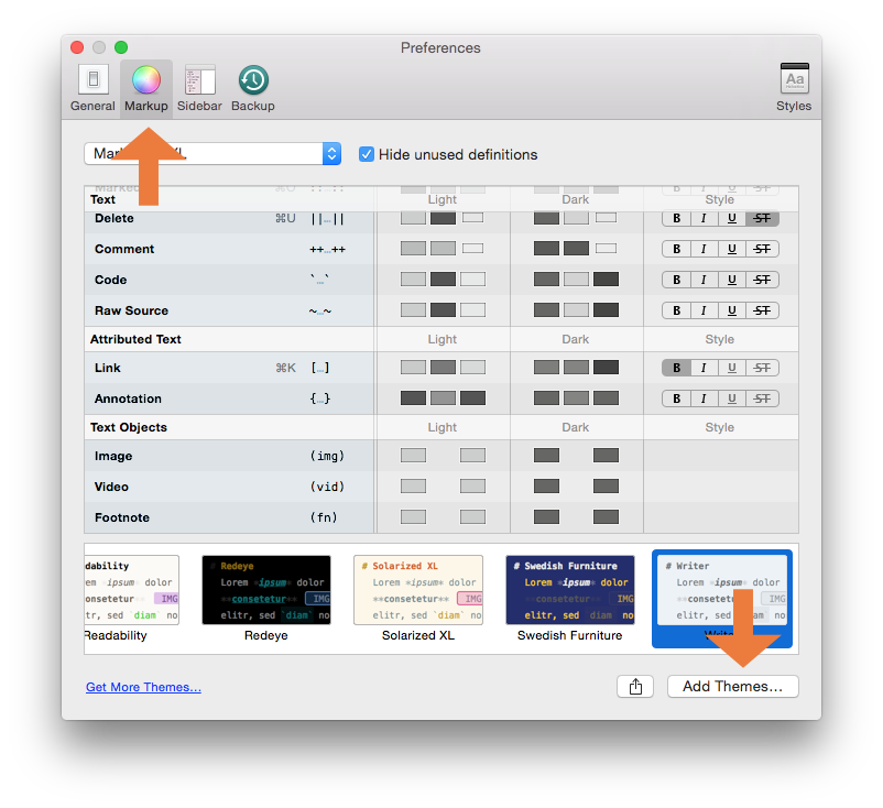
To make a theme available in Ulysses for Mac, use the provided link and download it from the Ulysses Style Exchange. Then go to Ulysses’ Preferences, switch to the Markup tab and choose “Add Themes”.
On iPad, it is even easier: When you’re downloading a theme, you will be prompted to open it with Ulysses for instant installing. In case you like to switch back to a theme you already have: Tap the gear icon to access Ulysses’ settings, then select Theme and choose one from the list.
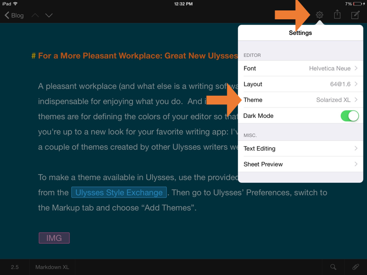
Note: If iCloud is enabled, the list of available themes will sync, so you need to download them only once. But you can of course choose a different theme on each connected device.
