Yesterday, Apple released iOS 11. Needless to say, we’re hard at work bringing Ulysses to Apple’s latest and greatest, but we’re not quite ready yet. So I’d like to tell you a bit about what you can expect. Release? Soon.
As you may know, iOS 11 has a strong focus on iPad — from revised Multitasking to Drag and Drop, it’s all about the big screen. Since we had to change quite a few things anyway (large table headers, spring-loading groups, yay), we took the opportunity and updated Ulysses’ interface in various places.
The first thing you may notice is how several buttons are gone or have traded places. We’re now much more compliant with how iOS handles things, which is a good thing, even if it takes some getting used to, if you’re a veteran user.
Most of these changes were a long time coming (e.g. “Edit” on top), while others were logical results of adopting iOS 11 (three-pane editing on iPad Pro). But we’re also introducing several deliberate changes and fixes to make working with Ulysses even more streamlined and, ultimately, more productive.
New Library
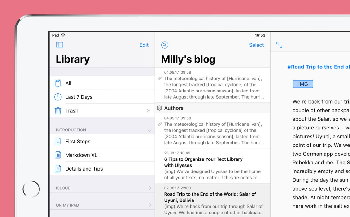
Ulysses on iOS now sports the same library as on Mac. Meaning that all sources are now available on the very first level. Have a look:
Sections can be collapsed, and we’ve added settings to hide sections you don’t need. There is now also a dedicated “On My iPad” section, which can live alongside your iCloud content — it won’t sync, of course, so tread carefully with your super-secret on-device-only material…
Multi-Pane Editing
In current versions of Ulysses, we only ever allow you to work in one pane, or “view”. If you’re tapping into the sheet list, for example, we will hide the library, and so on. This was nice for as long as it lasted (and it had several reasons I don’t want to get into), but we finally scrapped that behavior and will now let you work in as many panes and views as make sense on your device.

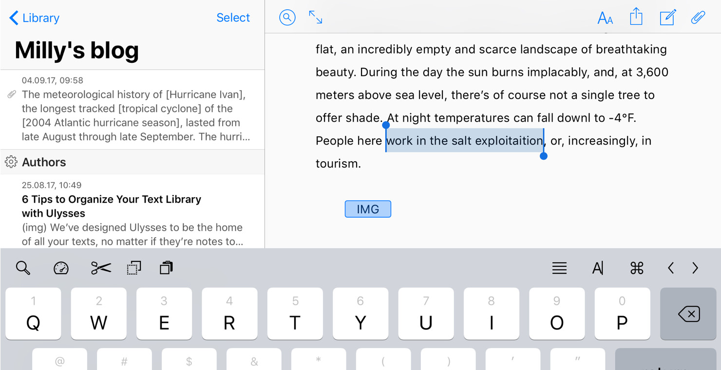
So yes, you can now keep the sheet list open while editing on iPad in landscape.
Of course, this change was mostly triggered by the elephant in the room…
Drag and Drop
iOS 11 introduces Drag and Drop across the board. It works within apps, between apps, and it’s a wonderful implementation to boot. However, it’s not automatic, and while it adds all kinds of greatness, it has a couple of pitfalls here and there, especially for complex apps such as ours.
We will eventually add Drag and Drop to pretty much all of Ulysses’ various views, but the first release will “only” support the sheet list and the editor. This may not sound like much, but… you’ll see.

Basically, you can now rearrange sheets at will, by simply picking them up and moving them around. You can now also drop images from Safari (or wherever) into the editor, for example. And you can drag text passages from here to there, just like that.
As stated, this is just step one. Moving forward, you can expect to see support for Drag and Drop added to attachments, export, and the library. The last one is a bit tricky, though, because of nesting. Speaking of which…
Collapsible Groups
We have completely switched how we handle collapsing of parent groups. Right now, collapsing is done via a swipe action, and the double caret will then act as a “focus” button, i.e. it will hide everything but that very group and its children from view.
The new version is now other way around: Tapping on the double caret will collapse or expand a group, while “focus” has moved to a swipe-action.

This may seem strangely crazy at first — why change this; people may be using it in their sleep, right? —, but it’s a much-needed change, as collapsing is much more obvious now, and has to work while performing Drag and Drop (spring-loading) without feeling awkward.
And that’s another wrap. For now. There’s much more coming in the next update, so… stay tuned.
And again: Release? Soon. :)
Have fun!
